Case Study
BETHANY ELKHORNBethany Elkhorn is a Lutheran church based in Omaha, Nebraska with over 10,000 people attending church services every week.
Intro
How We Took A Frustrating User Experience And An Out-Of-Date Design To One Of Peace And Simplicity.
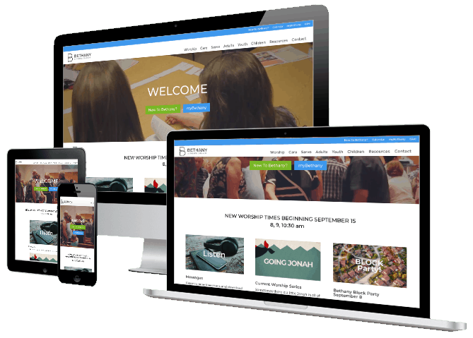
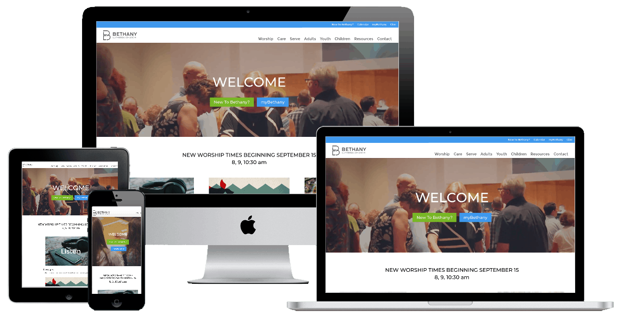
Bethany Elkhorn’s main problem is with the volume of pages they have on the site, numbering over 120 pages of unique content. With a site that large, it needs to be easy to use and find what you’re looking for. Additionally, the website was not mobile responsive and made for a users’ worst nightmare to try to use and navigate the website.
project details
Client: Bethany Elkhorn Lutheran Church
CMS: WordPress
Services:
– Responsive Website Redesign
– Replatforming (Drupal to WordPress)
– Information Architecture Planning and Navigation Restructuring
– Website Hosting
– Website Service Agreement
Details
CLEANING THINGS UP WITH A MODERN DESIGN AND LOGICAL PAGE STRUCTURES
Challenge
Taking the number of pages on the site and logically ordering them so they are no farther than 2 clicks away posed a serious challenge. Mobile responsiveness is also a high priority and to bring in a fresh, clean design that is both easy to look at and intuitive to use.
Solution
Our information and layout architechture specialists went to work to map out logically where every page needed to be located so that no page was more than 2 clicks away and was easy to find even after returning to the website. Out development team put together a very clean and easy to navigate design to complement the new information layout.
the reveal
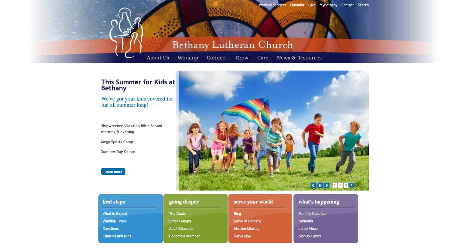
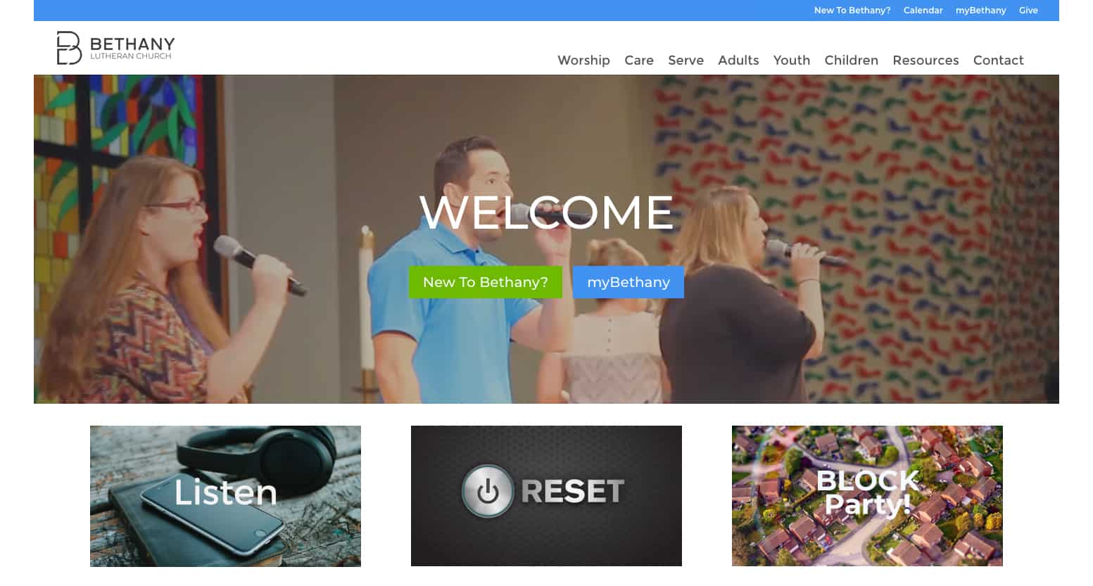
Before And After Screenshots
Before
After
Details
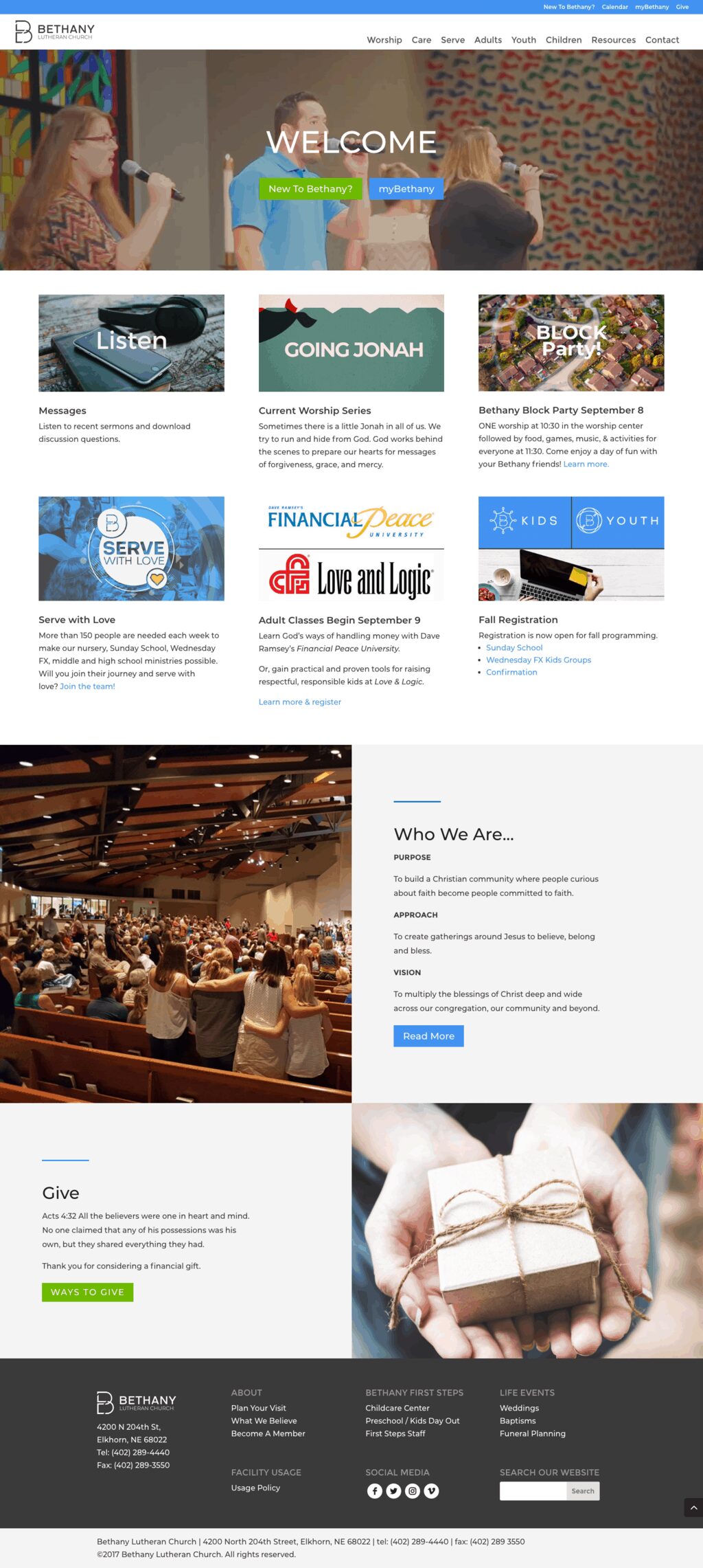
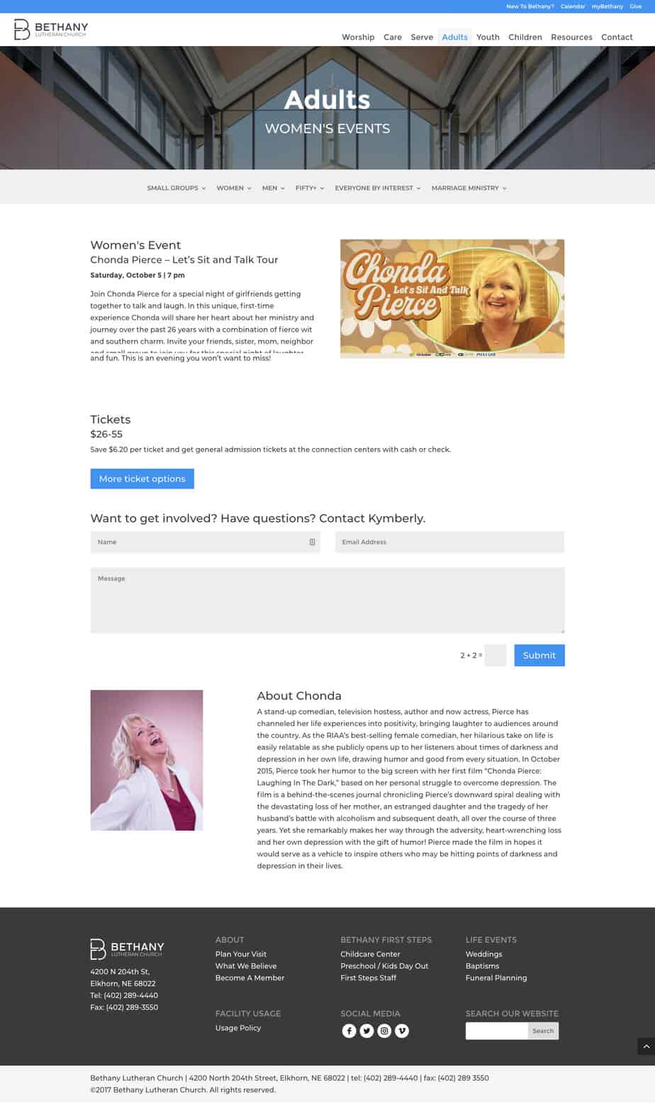
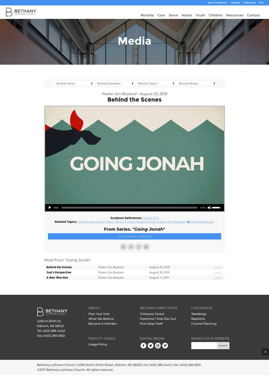
Full Page Screenshots
Click on images to open the website page in a new browser.
Want To Work With Us?
Contact us today and let us help bring your business to life online!

